Abide
UX Research & Product Design
Read time:
5 min
Client:
Abide
UX Design · ASO · Paid Social
Start:
End:
Duration:
16 Weeks
Abide is a Christian meditation app with over a million downloads. I was brought in through Twigeo to run static ad creative, and ended up helping modernize their subscription model, redesign their App Store presence, and shape the visual direction that fed into their rebrand.
Starting point
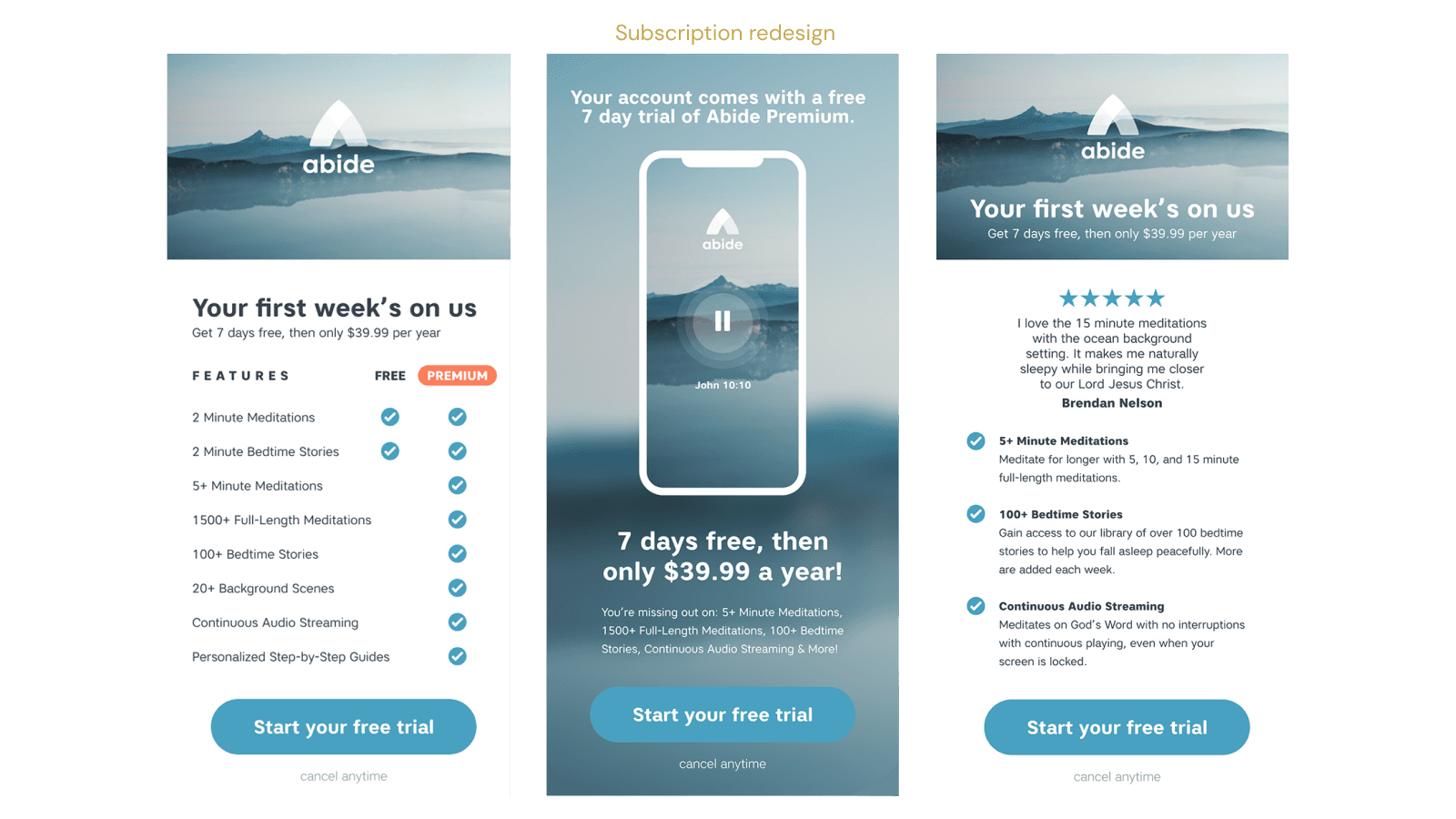
Twigeo brought me on to run static ad creative for Abide. That was the job. What it turned into was something else entirely. Abide's checkout flow was almost impossible to describe without it sounding like a joke. To upgrade to premium, users had to go to the website, then either email the team, mail a physical check, or pay online for a full year upfront at $70. Then create an account. Then receive a code. Then input that code to unlock premium. On a mobile app. In 2022.

Problem solving
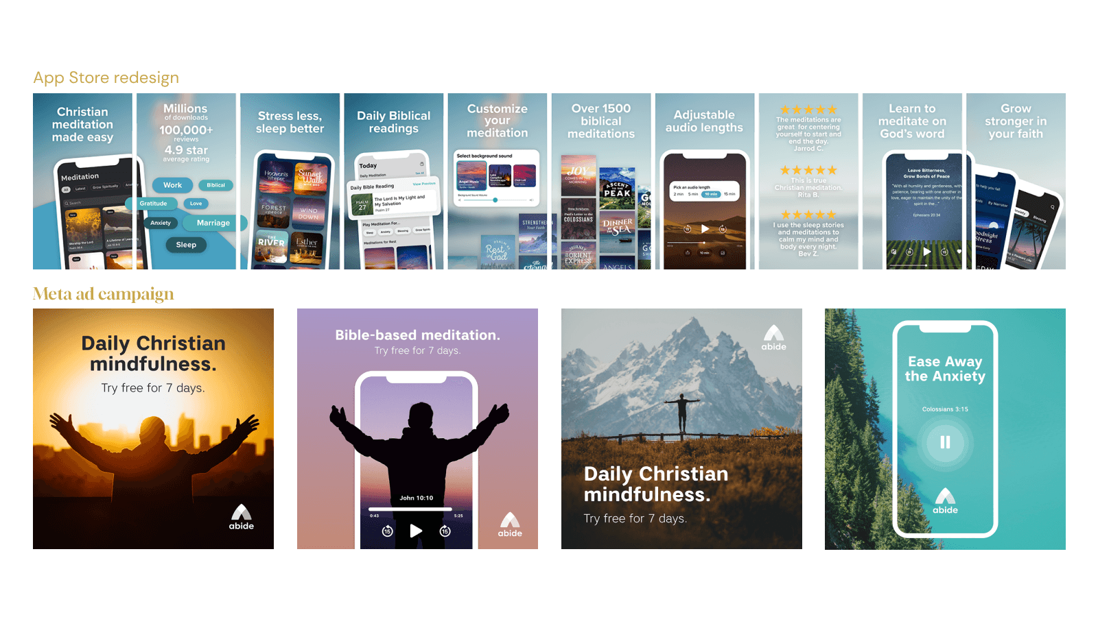
Early on, App Store Optimization got added to the scope. I learned ASO from scratch working alongside an external team based in Stockholm, collaborating across a wide timezone gap to get the campaigns performing. Working that closely with the product meant I was spending a lot of time inside the app itself, and that's when I started noticing things that had nothing to do with my brief. The benefits screen was just as bad — all it said was the premium tier was ad free with extended bedtime stories. No mention of continuous audio streaming, no mention of the fact that you could lock your phone and keep it playing, which for a sleep app is one of the most important features they had.
Implementation
I put together a full modernization pitch and presented it directly to Abide's marketing lead. The pitch covered three things: a monthly subscription option through Apple at $9.99 alongside the existing $70 annual plan, a rebuilt benefits screen with a proper free vs premium feature comparison, and new homepage designs that pushed a calmer, more natural visual direction. Working alongside a PM and data analyst, I designed the full subscription experience solo: the free vs premium comparison screen, the benefits breakdown surfacing features users didn't know they had, testimonials pulled directly from real App Store reviews, and new homepage concepts that pushed the brand toward something calmer and more considered.
Results
The App Store reviews weren't just decoration. We used them to mine keywords for ad campaigns, tailor messaging across social, and A/B test different angles. The reviews told us what users actually valued, and we built the messaging around that. Moving to Apple's subscription platform made the whole checkout modernization click into place.

