Steam
UX Research & Product Design
Read time:
4 min
Client:
Steam
Independent UX Research
Start:
End:
Duration:
16 Weeks
Steam is the world's largest digital game distribution platform with hundreds of millions of users. I always found it a bit overwhelming to navigate, and I wanted to know if that was just me. It wasn't.
Starting point
The research question was simple: if one of the most used platforms in the world is frustrating its own users, what's actually going wrong and who is it hurting most? I recruited 12 Steam users ranging in age from 24 to 45, with varying levels of gaming experience and accessibility needs. Rather than just asking what they thought, I gave them structured tasks to complete: redeem a gift card, find a review for a specific game, and explore freely. Each session ended with an open conversation about what frustrated them and what they wished was different.
Problem solving
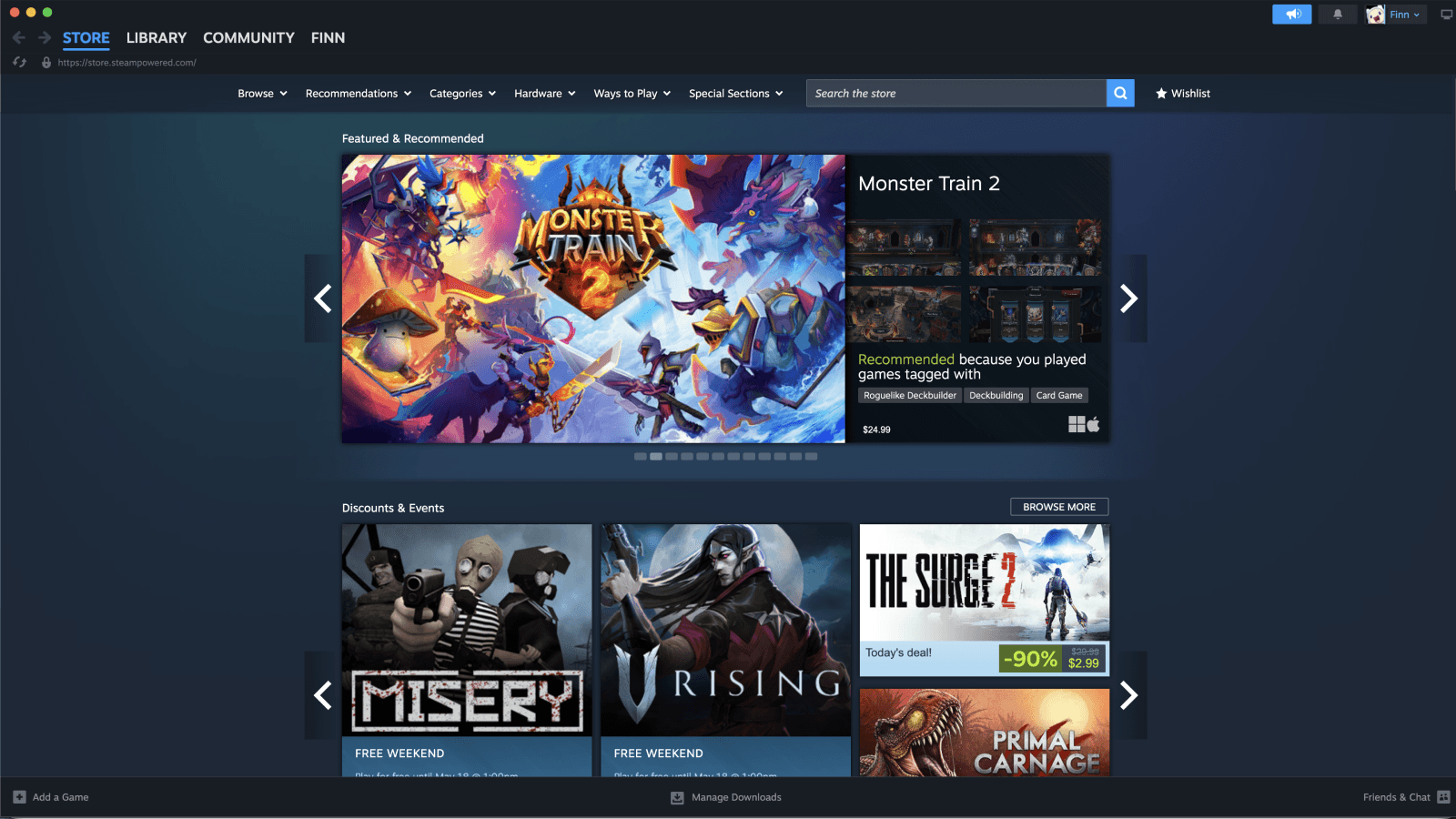
The overwhelming theme was exactly that: overwhelm. Eight out of twelve participants said the homepage made them feel bombarded rather than guided. Four clear problem areas emerged from the interviews: an overwhelming homepage dominated by promotions, a recommendation system that felt completely generic, a navigation structure with no clear hierarchy, and accessibility features that were either hidden or missing entirely. Every design decision in the concept work came directly from one of these findings.

Implementation
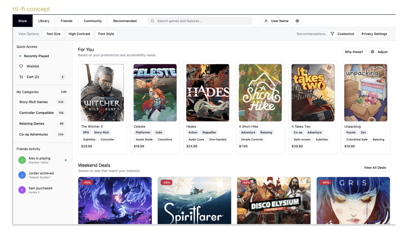
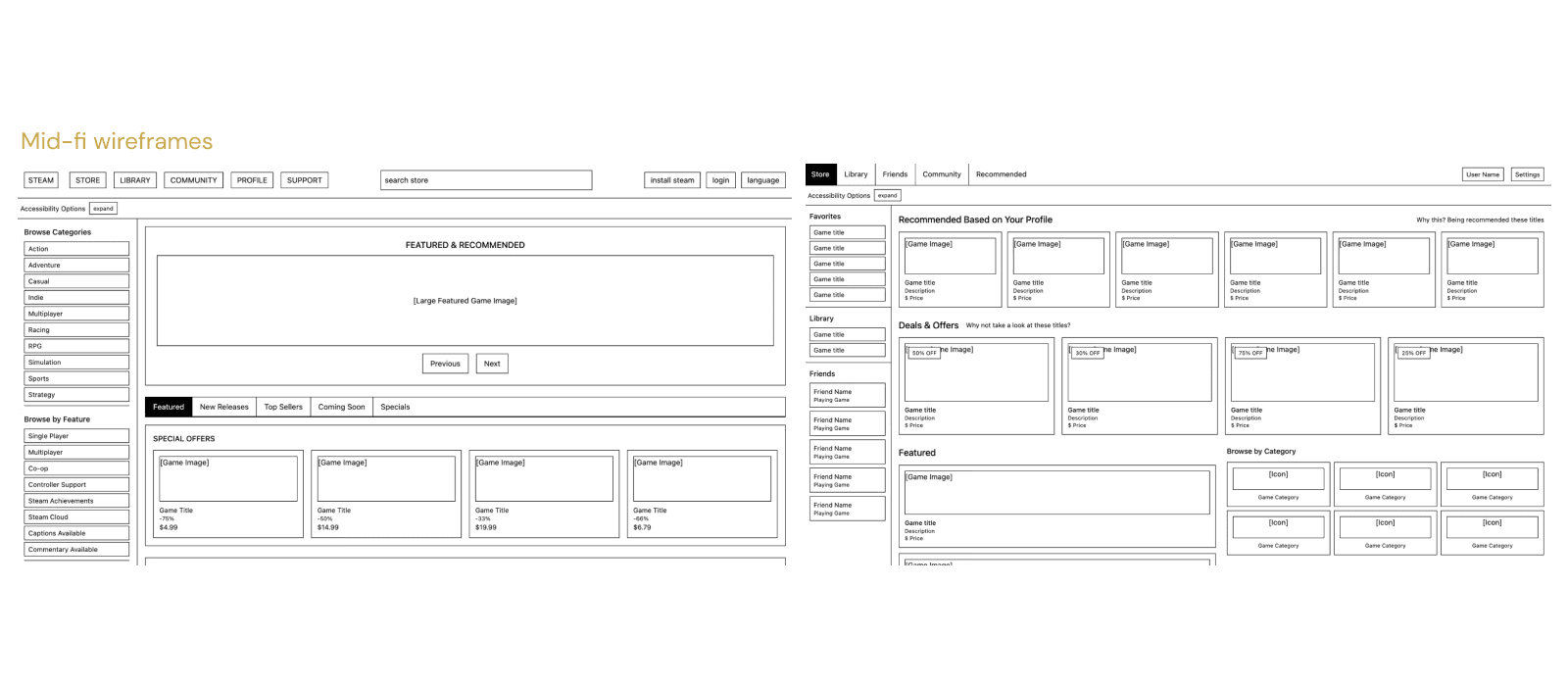
Starting from a content map that prioritized personalization and accessibility over promotion, I worked through low-fidelity wireframes for both the current Steam layout and a redesigned version, then developed a higher-fidelity concept showing what a cleaner, more considered Steam could look like. The accessibility options bar at the top came from Riley and Paul. The why these transparency on recommendations came from Danae and Kit. The genre and accessibility tags on each game card came from users who had no way to filter for what actually mattered to them. The goal was never to redesign Steam for the sake of it. It was to show what research-led decisions look like when you actually listen to the people using the product.
Results
This project changed how I think about accessibility. It is easy to treat it as a checklist. Talking to real users showed me it is a spectrum that touches every part of the interface, from font sizes to navigation structure to how hidden a feature is. The research also confirmed something I suspected: people do not want less, they want less noise. There is a big difference.